
This article provides essential tips for creating clear, engaging, and informative data visualizations. From choosing the right chart type to optimizing color schemes and labeling, these best practices will help you convey your data story effectively. Whether you're working with dashboards, reports, or presentations, mastering these techniques will elevate the impact of your data visualizations.

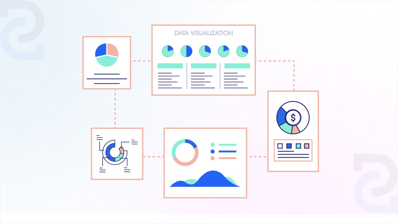
Data visualization is the art of turning complex data into clear, visual insights that help businesses and individuals make informed decisions. Whether it's a simple bar chart, an interactive dashboard, or a heatmap, visualizing data makes patterns, trends, and outliers easier to understand at a glance.
With the explosion of data in every industry, knowing how to present information effectively is more important than ever. Poorly designed visuals can confuse or mislead, while well-structured visualizations can drive better decision-making.
Creating impactful data visualizations requires more than just plotting numbers on a chart. A well-designed visualization should be clear, engaging, and easy to interpret, ensuring that viewers can quickly grasp insights without confusion. Poorly designed visuals can mislead, distort data, or overwhelm the audience with unnecessary details.
To make your visualizations more effective, follow these nine best practices. From choosing the right chart type to ensuring accessibility, these tips will help you present data in a way that is both visually compelling and informative for decision-making. Let’s dive into the essential techniques for creating clear and meaningful data visualizations.
The foundation of effective data visualization is selecting the right chart type for your data. Using the wrong format can lead to misinterpretation, confusion, or even misleading insights. The goal is to choose a chart that best represents your data's story while ensuring clarity and accuracy.
Different charts serve different purposes:
Using the wrong chart can distort the message. For example, using a pie chart instead of a bar chart to compare multiple categories can make differences hard to distinguish. Similarly, a line chart for categorical data (like department-wise sales) can create a false sense of continuity.
Before choosing a chart, ask yourself: What is the key takeaway I want my audience to understand? Ensuring the right visual representation improves comprehension and leads to better, data-driven decisions.

A common mistake in data visualization is overloading charts with too much information. While it's tempting to add extra details, complex visuals often confuse rather than clarify. The best data visualizations are simple, focused, and easy to interpret at a glance.
Avoid unnecessary gridlines, excessive labels, or too many data points that can clutter the chart. Instead, emphasize the most important insights by removing distractions. A clean and well-structured visualization directs the viewer’s attention to key takeaways without overwhelming them with excessive details.
For example, if you're displaying quarterly sales trends, a simple line chart showing revenue over time is far more effective than a graph filled with multiple trend lines, annotations, and unrelated data points. Similarly, when presenting survey results, avoid 3D effects, decorative elements, or excessive color variations that might make interpretation difficult.
Before finalizing a visualization, ask:
A simple, well-designed visualization ensures that the story behind the data is clear. The goal is not to impress with complexity but to communicate insights effectively so decision-makers can quickly grasp what matters.
Color plays a crucial role in data visualization, but when misused, it can confuse the audience instead of clarifying insights. The right use of colors enhances readability, emphasizes key data points, and ensures consistency across reports and dashboards.
When choosing colors, avoid using too many or overly bright hues, as they can be distracting. Stick to a limited, consistent color palette that aligns with your brand or theme. If multiple colors are needed, use shades of the same color to represent variations within a category rather than using random colors that may not have a clear meaning.
Colors should also convey meaning and hierarchy in your visualizations. For example:
A mistake many make is using colors purely for decoration rather than for clarity and emphasis. For instance, using random colors in a bar chart can make it difficult for viewers to identify patterns. Instead, reserve bright colors for key insights, such as highlighting the highest-performing region or the most significant trend in your dataset.
Before finalizing a visualization, ask yourself: Does the color scheme enhance understanding or create confusion? A well-thought-out color strategy improves readability and helps viewers process information more effectively.

Labels are essential for making data visualizations easy to understand, but if they’re unclear, inconsistent, or cluttered, they can lead to misinterpretation. Every chart, graph, or dashboard should have clear, concise, and accurate labels that guide the viewer to the right insights without confusion.
Avoid ambiguity by ensuring that all axes, data points, and categories are labeled properly. For example, in a bar chart comparing monthly sales, labeling the x-axis as just "Months" is vague—using "January 2024, February 2024, etc." is far more effective. Similarly, for percentage-based data, include "%" signs rather than assuming the viewer will infer the unit.
Best Practices for Effective Labeling:
A common mistake is overloading a chart with too many labels, making it difficult to read. Instead of placing values on every bar in a bar chart, highlight only key figures or use tooltips in interactive dashboards.
Finally, always double-check spelling, alignment, and accuracy before publishing a visualization. A mislabeled chart can mislead the audience and undermine credibility. Clear, accurate labeling ensures that viewers grasp the intended message quickly and correctly.
Scaling and proportions are critical in data visualization because they directly influence how data is perceived. If a chart’s scale is distorted, it can exaggerate or minimize differences, leading to misinterpretation of insights. A well-scaled visualization ensures that data is represented accurately and fairly.
One common mistake is starting the y-axis at a non-zero value, which can artificially amplify small differences. For example, a bar chart comparing revenue across two years may seem to show a dramatic increase if the y-axis starts at 90 instead of 0, even if the actual growth is minimal.
Best Practices for Proper Scaling:
Another issue is uneven scaling in time-series data. If a line chart tracks sales growth but has uneven time intervals, trends may appear misleading. Always ensure that time intervals are uniform to maintain data integrity.
Before finalizing a visualization, ask: Does the scale fairly represent the data, or does it create an illusion? Proper scaling and proportions help maintain accuracy and prevent misleading interpretations, ensuring that viewers trust the insights being presented.
A great data visualization should immediately draw attention to the most important takeaways. If viewers have to search for the key message, the visualization isn’t doing its job. Highlighting critical insights ensures that decision-makers can quickly grasp the most relevant information without getting lost in unnecessary details.
One way to emphasize key insights is by using contrast. This can be done through:
For example, in a sales performance dashboard, instead of showing all regions in the same color, you can highlight the top-performing region in green and the lowest in red. Similarly, in a trend analysis, adding a callout box or text annotation to mark major turning points helps viewers focus on what matters.
Another effective method is progressive disclosure—gradually revealing deeper insights as users interact with the visualization. This is particularly useful in interactive dashboards, where users can drill down into specific data points.
Before finalizing a visualization, ask: What is the main message I want to convey? Is it immediately clear? A visualization should guide the viewer’s eye to the most crucial insights, ensuring data-driven decisions are made faster and with confidence.
Data alone doesn’t drive decisions—stories do. A well-structured data visualization should not just present numbers; it should tell a compelling story that guides the audience through the insights in a logical and engaging way. Data storytelling combines facts with context, making information more memorable and actionable.
Start with a Clear Narrative
Before designing a visualization, identify the main message you want to convey. Ask yourself:
A good data story follows a beginning, middle, and end structure. Start with background context, highlight the main insights, and conclude with a call to action or recommended next steps.
Use Visual Cues to Guide the Audience
A great story keeps the audience focused on the most important parts of the data. Use:
For example, if you’re showing sales performance, instead of displaying a static bar chart, guide the audience through key trends with progressive insights, such as seasonal spikes, regional differences, and growth opportunities.
Make It Relatable
Numbers become more impactful when connected to real-world scenarios. Use comparisons, benchmarks, or customer success stories to make data more meaningful. Instead of saying, "Revenue increased by 20%", compare it to past performance or industry trends: "Revenue grew 20%—twice the industry average."
Data storytelling turns insights into action. By structuring data with a clear narrative, guiding the audience with visual cues, and making insights relatable, businesses can drive better decisions and create more engaging data experiences.
A great data visualization should be clear, readable, and accessible to all users, regardless of their expertise or abilities. If a chart is difficult to interpret or excludes certain audiences, it fails to communicate its message effectively. Ensuring accessibility and readability allows everyone to engage with the data and make informed decisions.
Use Clear Fonts and Text Sizes
Avoid overly decorative or small fonts that make labels hard to read. Stick to legible, professional fonts like Arial, Roboto, or Open Sans. Text sizes should be large enough to be readable across devices—especially for dashboards viewed on mobile screens.
Provide Adequate Contrast for Visibility
Low contrast between text and background can make visualizations difficult to read. Use high contrast color schemes, especially for users with visual impairments. For example:
Use Color-Blind-Friendly Palettes
About 8% of men and 0.5% of women have some form of color blindness. Avoid relying solely on red-green or blue-yellow color schemes. Instead, use patterns, labels, or icons alongside color to ensure accessibility. Many BI tools offer color-blind-friendly palettes, such as ColorBrewer or grayscale alternatives.
Make Visuals Interpretable Without Additional Context
Every visualization should stand on its own. Add clear labels, legends, and concise descriptions to help viewers understand the data without needing external explanations.
An accessible, well-designed visualization ensures that everyone—regardless of ability or expertise—can engage with and understand the insights. Prioritizing readability and inclusivity makes data-driven decision-making truly effective for all users.
The effectiveness of your data visualization depends not only on how you present data but also on which tool you use. Different tools cater to different needs, from simple chart creation to advanced interactive dashboards. Selecting the right tool ensures that your data is accurate, visually appealing, and easy to interpret.
Consider Your Data Complexity and Needs
Before choosing a tool, ask:
For basic visualizations, tools like Google Charts or Excel work well. For interactive dashboards, Tableau, Power BI, and Looker are powerful options. If you're embedding analytics into a product, Explo is an excellent choice.
Evaluate Customization and Ease of Use
Some tools offer drag-and-drop functionality, making them ideal for non-technical users. Others require coding expertise (e.g., D3.js, Plotly) for highly customized visualizations. Choose one that fits your team’s skill level and customization needs.
Look for Integration and Sharing Capabilities
A good visualization tool should integrate with your existing data sources (SQL, APIs, cloud storage) and allow easy sharing via reports, dashboards, or web embedding.
Consider Cost and Scalability
Some tools are free with limited features (Google Data Studio), while enterprise tools (Tableau, Power BI) offer advanced analytics at a cost. Pick a tool that aligns with your budget and future scalability needs.
The right data visualization tool should match your use case, technical expertise, and business goals. Selecting a tool that balances usability, performance, and integration capabilities ensures that your data is not just visualized—but understood and acted upon effectively.
Effective data visualization is not just about presenting numbers—it’s about ensuring that insights are clear, accurate, and actionable. A well-designed visualization helps businesses and decision-makers identify trends, uncover patterns, and communicate findings effortlessly. However, poor design choices—such as misleading charts, cluttered layouts, or inconsistent scaling—can lead to confusion and misinterpretation.
By following best practices—choosing the right chart type, simplifying visuals, using meaningful colors, ensuring readability, and incorporating data storytelling—you can create engaging and insightful visualizations. Additionally, selecting the right data visualization tool enhances efficiency, allowing users to work with real-time data and interactive dashboards seamlessly.
The goal of data visualization is not just to display information but to make it easier to understand and act upon. Whether for business analytics, research, or reporting, applying these principles ensures that your visualizations effectively tell the story behind the data, driving better decisions and meaningful outcomes.


